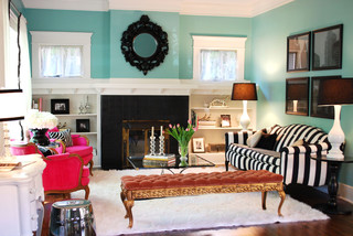
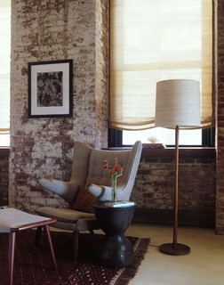
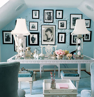
The holidays can often mean a standard style of decorating...... A tree in the corner, fluffy wreath on the door, and stockings hung from the mantle. Not to say this style of holiday decorating is boring, but why not kick things up a notch by adding fun designer touches in, whether its with color, texture, or both. One of my favorite pieces of holiday decor is a white feather wreath I created years ago that says holiday but in a very quiet voice. Take a look at some inspiring photos below, and if getting crafty isn't for you, contact the experts at Revive Design!
Holiday Trends: Have Fun!
Posted by
Revive Design
on Thursday, November 11, 2010
Labels:
Holiday,
interior design,
Modern,
Unique
/
Comments: (0)
Todays Hot Color: BLUE
Posted by
Revive Design
on Tuesday, November 2, 2010
Painting with color can be intimidating, even for professionals. It is hard to tell how a room will turn out until all the paint is on the wall, and even then, sometimes it can take a day or so to really see true color. Practice makes perfect with the world of color, and today I'm passionate about blue! So today think BOLD and see if blue is the color for your home, and if you not sure, call a pro like me!
 |
| Blue is a great bedroom color because it is a relaxing and tranquil! |
 |
| Wow, this is teal and it's fabulous!! |
 |
| Thanks to West Elms catalog, you can now see their line of rich Benjamin Moore paints |
 |
| This butlers pantry is featured in this months Elle Decor, but I can certainly see an entire kitchen in this incredible color! |
 |
| This deep, rich color is perfect for a room with good light, maybe even used as an accent color! |
Traditional Silhouettes in Modern Environments
Posted by
Revive Design
on Saturday, October 30, 2010
Labels:
Modern,
Sofa,
Traditional
/
Comments: (0)
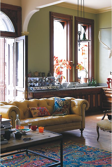
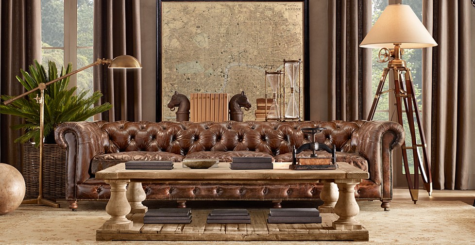
Sofa........The heart of the living/family room..........A place of peace and comfort.....And now a reflection of the past in a modern home
Bring Zara Home to the US!
Posted by
Revive Design
on Thursday, October 28, 2010
Labels:
Bedroom,
Home Decor,
living room,
Zara
/
Comments: (0)
For the past few years, I've been a big fan of Zara, a Spanish based store that sells clothing similar in design to top brands, but priced extremely well! I love the unique clothing I can find in there without paying a high price, and there stuff lasts. What I didn't know until recently, is that Zara also has a home collection which also has incredible products, only problem is that they don't yet sell to the US...... you've got to be kidding me! I don't understand, and so I ask you Zara Home, please sell your amazing products here in the USA too!!
The Catalog Look is so OUT!
Posted by
Revive Design
on Tuesday, October 12, 2010
Labels:
Eclectic,
interior design
/
Comments: (0)
There is nothing I dislike more in design than someone who took a look at a catalog or a display in a store and bought everything to match what they saw. Trust me, when you do that, it looks just like a store display, and nothing feels less like home. A great home design is a group of treasures collected over time that show character. Check out some recent designs that really showcase the feel of great design!
Recycled Holiday Ornaments Now Available
Posted by
Revive Design
on Friday, October 8, 2010
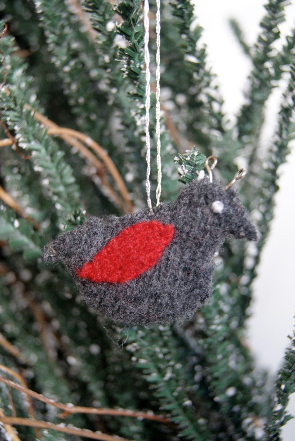
Here is the start to my new line of holiday ornaments, all made from repurposed wool sweaters. All are available for sale on my Etsy site (revivedesign.etsy.com) and I am currently taking custom orders. For more information, you can email me at revivedesign@verizon.net.
One of a Kind
Posted by
Revive Design
on Wednesday, October 6, 2010
Labels:
Accessories,
Etsy,
Homegoods
/
Comments: (0)
I know how tough it can be to resist the urge to go to Homegoods and re-accessorize your entire home with great discounted products. Trust me, I too often find myself there resisting the urge to splurge and instead have remember why I don't do it. Yes, most of the time I'm remembering the impact on the environment in creating these fun pieces, but also the waste knowing that for each new piece, an existing piece will no longer have a home. What I really think about though, is that there are thousands of people who shop at these stores every day, so how is my personal space going to be any different if we're all buying the same stuff! And that's where my desire to be unique and different appears so that I can put down that candlestick and walk away with pride!
Instead I focus my attention on the vintage sellers on Etsy, realizing that I'm not only going to get a great unique product, but I'm supporting a fellow seller who is not part of some large corporation. As a vintage seller on Etsy myself (yardsalesisters.etsy.com) I like to know I'm supporting someone just like me. And besides, where else can you get some of the best finds without spending hours and hours searching your Saturday morning yard sales or local vintage/antique shops.
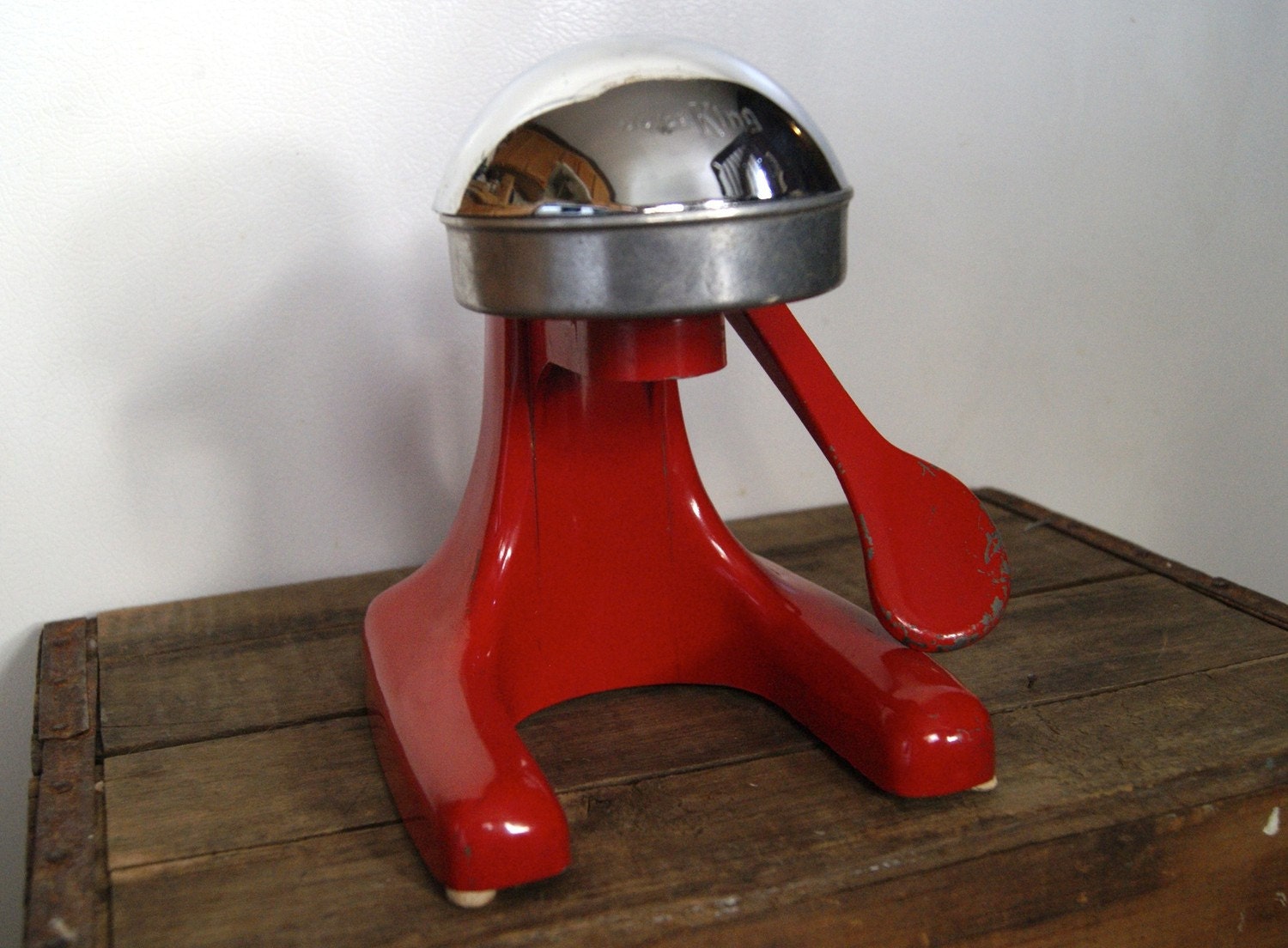
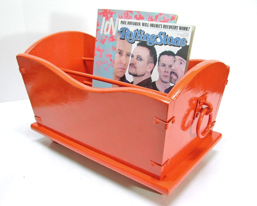
This week I wanted to focus on a seller that I've been following for some time, fishbonedeco.etsy.com. Just looking at their site shows you how much thought and effort they put into each of their selections, really focusing on the savvy vintage buyers looking for that perfect showpiece. I especially am attracted to their selection of simple, yet colorful items that really make a statement, seeing that nothing would just blend into the background. What a perfect way to decorate your house than to pick a few key items that make a bold statement, rather than an excess of typical items!
In my own home, there are a few pieces that I found and couldn't resist. Now they are the featured items in my home, and I don't need to overdo it with knick knacks and other dust collection items. So today's lesson encompasses a few things.......
1. Purchase unique items that tell a story, rather than typical pieces that may be in your neighbors house too.
2. Don't be afraid to spend a little more on one bold statement piece instead of multiple average pieces.
3. Less is more!
 |
| yardsalesisters.etsy.com |
 |
| fishbonedeco.etsy.com |
 |
| fishbonedeco.etsy.com |
1. Purchase unique items that tell a story, rather than typical pieces that may be in your neighbors house too.
2. Don't be afraid to spend a little more on one bold statement piece instead of multiple average pieces.
3. Less is more!
Green Products Part 1
Posted by
Revive Design
on Friday, October 1, 2010
Labels:
Eco,
Fabric,
Mod Green Pod,
Wallpaper
/
Comments: (0)
This week I've been researching the various design product companies who have made the choice to design and produce in a green manor. I found a lot of great new lines that I'll be sharing with you over the next few weeks, but today I had to share Mod Green Pod. As a manufacturer of fabrics and wallpaper, Mod Green Pod is using organic cotton as the base for their fabrics and all organic dyes, while their wallpaper is still a vinyl base, yet it is coated in a water based glaze and only uses water based dyes. By using these natural products in your home, you'll be creating a healthier environment for your family!
And now for one of my favorite parts of the Mod Green Pod website.... they're room creator! Take their designs out of those small boxes and create a fabulous space using all of their products. What a fun way to better visualize the beauty of their products!


And now for one of my favorite parts of the Mod Green Pod website.... they're room creator! Take their designs out of those small boxes and create a fabulous space using all of their products. What a fun way to better visualize the beauty of their products!
Brocade Home's Headboard Alternative
Posted by
Revive Design
on Wednesday, September 22, 2010
One of my favorite design techniques is putting a twist on a traditional design idea. Take a headboard for example, originally part of a whole bed construction is now used to frame an area behind the bed and perhaps provide a bit of support for when you want to sit up in bed and read. Well one of my favorite retailers Brocade Home creates the headboard idea in a totally different way, using wall art to create a focal point. Of course most of us do put art above our bed, but what I like about this is that it creates the illusion of a headboard and there is no longer a need to add artwork. REDUCE the amount of excess in your space and create a crisp, clean design for your most relaxing space!
Black, White, and Mod.....
Posted by
Revive Design
on Monday, August 23, 2010
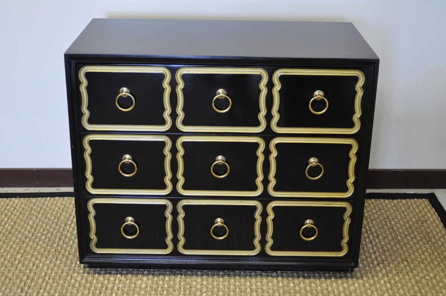 There is something a bit beautiful about a rain drop just sitting on a pane of glass. Have you noticed how the reflection shows so much contrast between black and white, but also adds a bit of color from it's surroundings? "Why can't design be the same?" I asked..... "It can!", I said.
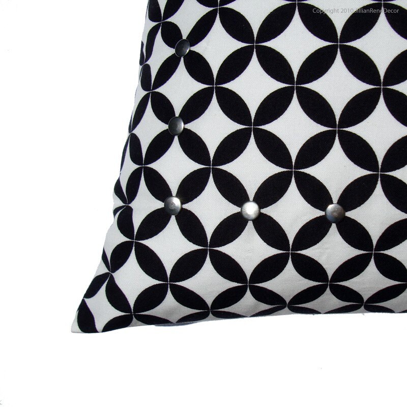 A bold contrast between black and white has long since been a "hot" design trend, and will continue to be fabulous! I think we can all remember the stark contrast of black and white on those diner floors, the "groovy" geometric patterns on clothing in the 60's, and now the continued love of these two "non-colors" living in harmony! There are really no rules when it comes to adding this to your style, but if there is one lesson I can teach, don't over do it!! Keep it classy and simple, and for an added boost of fun, add a bright color to make it pop! Perhaps it's because I'm on a yellow kick, but yellow screams happiness and light, and what better balance to a stark contrast than just that.
Take for example this treasury I created which is almost exclusively in black and white's, but to make it my own, I added a punch of yellow. Using neutrals such as black and white is a great foundation for a design, just keep it simple, and you'll go far!
Art vs. Books
Posted by
Revive Design
on Saturday, August 21, 2010
In our society today, we're beginning to lean away from the traditional paper book. Whether hard or soft back, a physical book may be a vintage item in our near future thanks to electronic book systems such as Kindle. Now I myself am not sold on the whole idea, and it brought to mind a design style that is highly debated.
Some say it's a new trend, others say its been used for years, but is hanging art on a bookcase a good design? Yes, it's going to potentially cover some books and make it more difficult to access them, but to me it brings to life the systematic geometry of a traditional built-in. Shelf shelf shelf..... shelf shelf shelf, and the only thing to break that up are the books you put in it, or the various knick knacks you choose. What better way to break up the monatoany of a bookcase than to add a dimensional piece hung from the front?

So what do you think.... is it a silly, impractical application or a unique twist on the typical built in??
Some say it's a new trend, others say its been used for years, but is hanging art on a bookcase a good design? Yes, it's going to potentially cover some books and make it more difficult to access them, but to me it brings to life the systematic geometry of a traditional built-in. Shelf shelf shelf..... shelf shelf shelf, and the only thing to break that up are the books you put in it, or the various knick knacks you choose. What better way to break up the monatoany of a bookcase than to add a dimensional piece hung from the front?

So what do you think.... is it a silly, impractical application or a unique twist on the typical built in??
Etsy Interior Design
Posted by
Revive Design
on Sunday, August 15, 2010
 |
| WhiteCove |
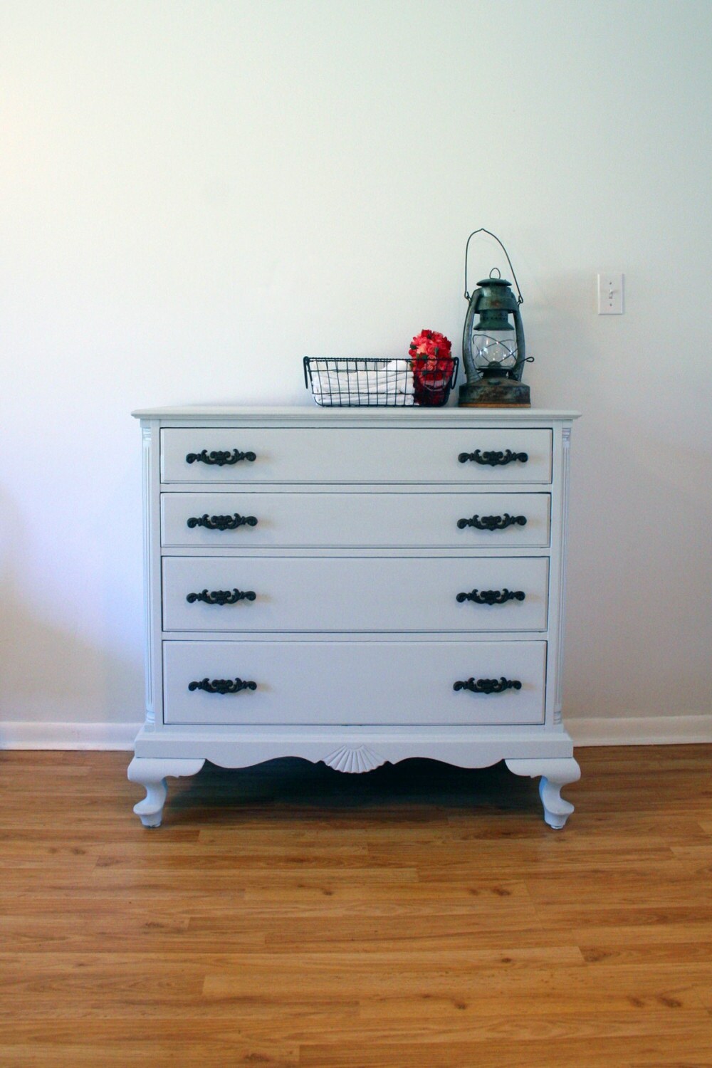
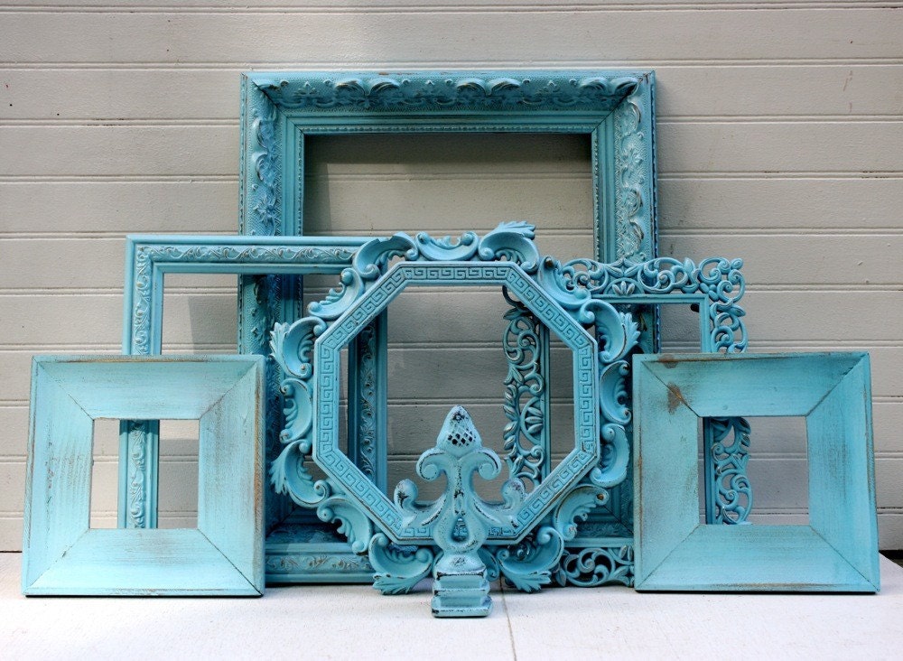
It's true, I'm not only a seller on Etsy, but also a buyer and a stalker. I can spend hours looking at the thousands of items on the site, when I have nothing in particular that I'm looking for. I suppose it's similar to Facebook stalking, where you creep around looking at photos of people you barely spoke to 10 years ago. Today I decided to be productive with my Etsy stalking, and found a collection of new favorites which I used to create a Treasury.
 |
| FunkieFinds |
 |
| Artful Vintage |
Want me to create a treasury exclusively for you?? It's easy, just contact me!!
Mix It Up!!
Posted by
Revive Design
on Sunday, August 8, 2010
Labels:
Dining Room,
Eclectic,
Head Chairs,
Houzz.com
/
Comments: (3)
So one thing you'll get to know about me, is that I'm not your conventional by the book designer. Sure I can look at a catalog and love the way they've set everything up and appreciate they're merchandising, but who wants their space to look like a catalog... not me!
Today I really saw my own style in Houzz.com's ideabook called Mixed Company. It showcases how you don't have to use the same chair around a table, that mixing it up looks fabulous! Personally I don't love every image, but they give you a lot to think about. Here's my take on mixed company......
**When you have more than 6 seats at a table, have 2 larger and bolder chairs at the head, and maybe mix in a bench on the side.
** Mixing up chairs can be a practicality issue, especially if you are low in seating for another space. Using a lounge chair at your table can double as an extra seat in your living space when you're entertaining
Your home should look as though it's been collected over time.... so have fun with it!!
Today I really saw my own style in Houzz.com's ideabook called Mixed Company. It showcases how you don't have to use the same chair around a table, that mixing it up looks fabulous! Personally I don't love every image, but they give you a lot to think about. Here's my take on mixed company......
**On a small table, mixing more than 2 styles of chairs can look a little hodgepodge. Keep the scale similar and switch up the silhouettes.
** Mixing up chairs can be a practicality issue, especially if you are low in seating for another space. Using a lounge chair at your table can double as an extra seat in your living space when you're entertaining
Your home should look as though it's been collected over time.... so have fun with it!!


