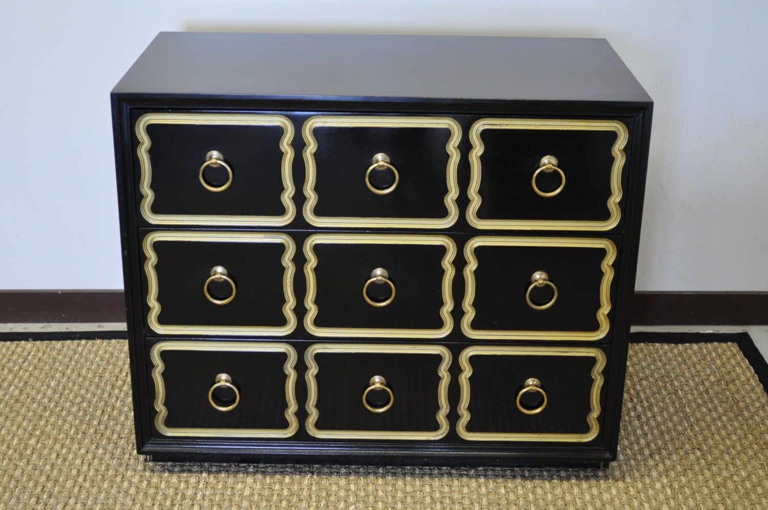
 There is something a bit beautiful about a rain drop just sitting on a pane of glass. Have you noticed how the reflection shows so much contrast between black and white, but also adds a bit of color from it's surroundings? "Why can't design be the same?" I asked..... "It can!", I said.
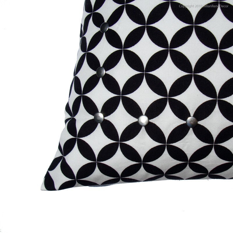 A bold contrast between black and white has long since been a "hot" design trend, and will continue to be fabulous! I think we can all remember the stark contrast of black and white on those diner floors, the "groovy" geometric patterns on clothing in the 60's, and now the continued love of these two "non-colors" living in harmony! There are really no rules when it comes to adding this to your style, but if there is one lesson I can teach, don't over do it!! Keep it classy and simple, and for an added boost of fun, add a bright color to make it pop! Perhaps it's because I'm on a yellow kick, but yellow screams happiness and light, and what better balance to a stark contrast than just that.
Take for example this treasury I created which is almost exclusively in black and white's, but to make it my own, I added a punch of yellow. Using neutrals such as black and white is a great foundation for a design, just keep it simple, and you'll go far!


